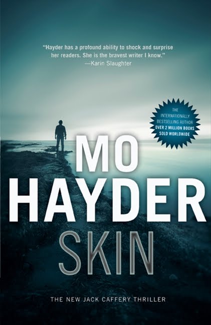
So what are you thoughts on the US (LHS), UK (RHS) and Canadian (below, middle) covers? Which would entice you to pick the book up if you were not familiar with Mo Hayder?
If you have read it, how does the cover match the story?
Here are Euro Crime reviews of Skin, by Maxine and Michelle.


7 comments:
The Canadian cover looks more attractive to me.
Ooh, I like all these covers! In terms of which describes the book best, I think either the US or the UK - they reflect different themes of the book. The US edition seems the most "different" but the UK more artistic (moody), so I really can't decide which one I like best. The Canada one is perhaps a bit too generic though it's a nice image.
The UK cover describes the book perfectly. It's very dark (well, this is Hayder) and it looks like a real place (because it is). The US one doesn't look real, and the Canadian one (while attractive) doesn't hint at the book's content as well as the UK one.
I agree that the Canadian one looks too generic as for the other two they are both quite striking - I like the US one the best but haven't read the book so no idea if it fits at all
Karen - I like the UK cover the best. It conveys a moody, creepy feeling, I think, better than the others.
This week I like them all, but the UK one is still no one for me. Scary and appealing.
Well, I live in Canada but I have the UK cover. (go figure)
I like the UK cover best. I think the US and UK covers show parts of the story but the UK one is the darkest and creepiest.
I don't like the colours of either the US or the (supposed) Canada one but I really dislike the Canada one. Boring!
Post a Comment